
Logo & Packaging Design for Bhutan Highland Apiary
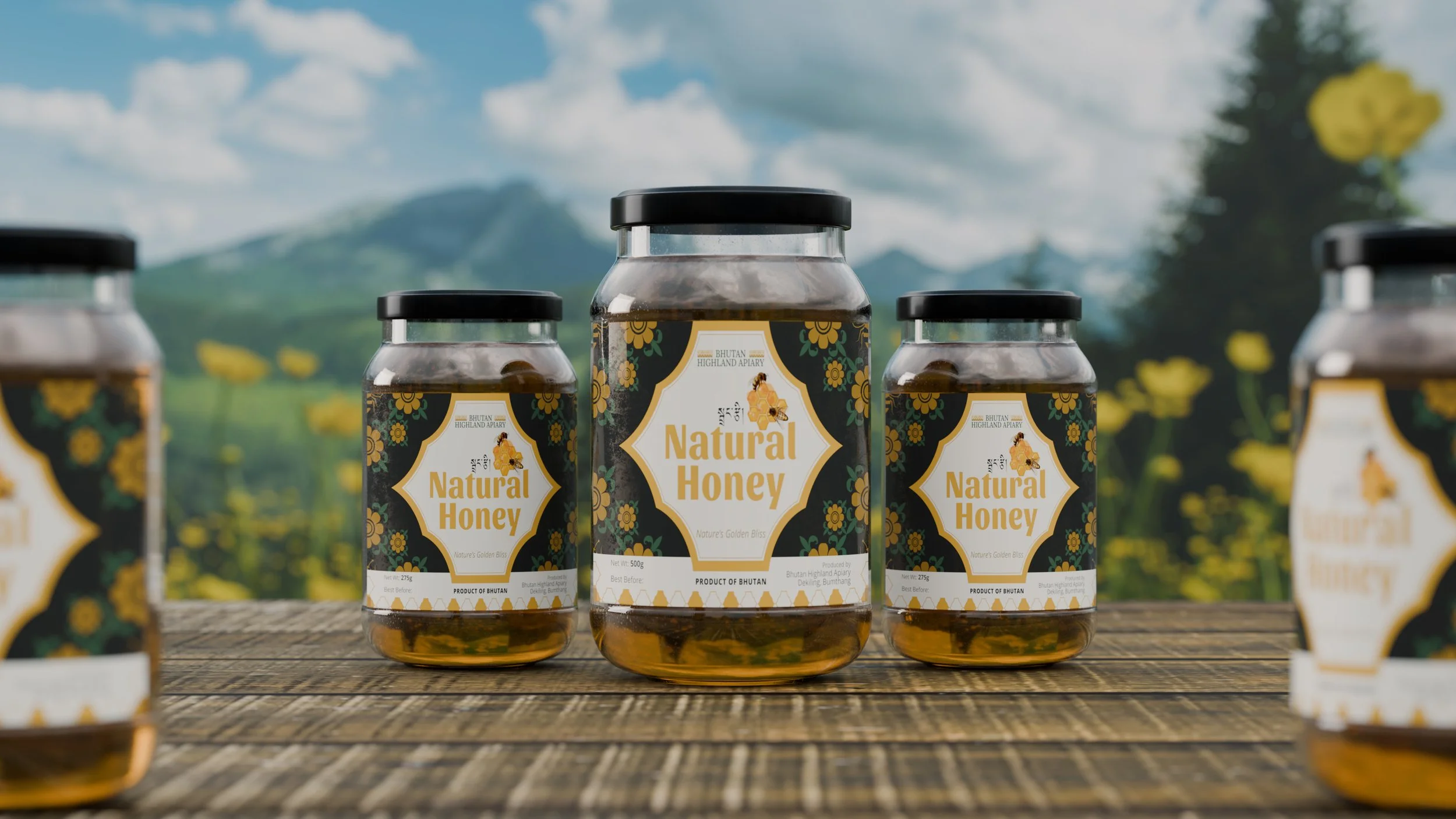
Bhutan Highland Apiary is based in the pristine Bumthang Valley, known for its rich biodiversity and unspoiled natural beauty. Surrounded by highland forests and wild meadows, the apiary practices sustainable beekeeping in harmony with nature.
Dedicated to producing 100% natural, pure honey, the bees forage on native wildflowers and medicinal plants, resulting in honey that is rich in flavor and natural goodness.
Bhutan Highland Apiary also supports local communities and helps preserve the region’s ecological balance, bringing honey that is truly authentic, wholesome, and Himalayan.


Bhutan Highland Apiary Logo Animation
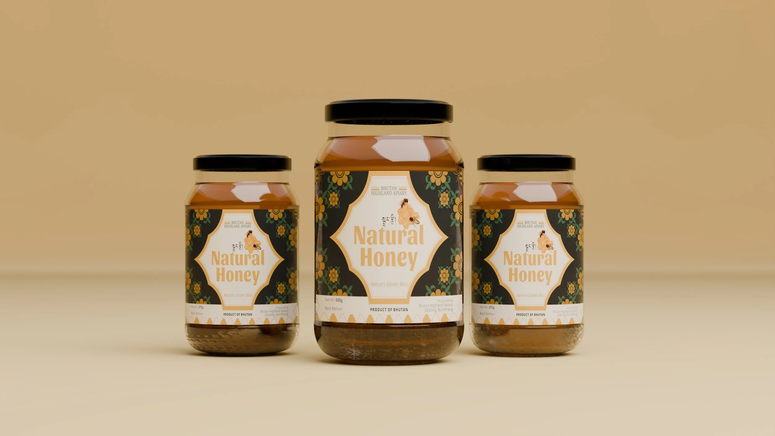
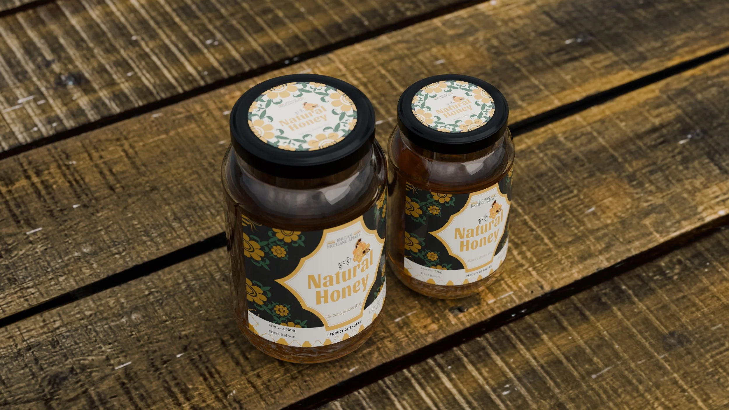
From the very beginning, the vision for this project was clear. With so many honey products already produced in Bhutan, many originating from Bumthang, we aimed to create packaging that would stand out while still honoring Bhutanese culture and tradition.
To capture this essence, we chose to incorporate a flower motif commonly found in traditional Bhutanese paintings. Instead of using the typical hexagon seen on most honey labels, we looked for a more meaningful interpretation. Our inspiration came from the lower part of traditional Bhutanese windows; elegant curves that, at their core, reveal a subtle hexagonal structure. This form became the foundation for a unique pattern used in the design, blending symbolism with visual identity in a way that feels both fresh and authentically Bhutanese.
Creative Direction
Design
Development